How to Uncover Vital Design Flaws with a UX Audit
The biggest folly in business is creating a solution before you understand the problem.
Zach Watson
.jpg)
The biggest folly in business is creating a solution before you understand the problem.
Even with a sprinkling of research in hand, it’s possible to solve the wrong problem, to build something no one wants. Money is wasted. Hopes are dashed. Postmortems begin.
It happens all the time. Businesses act out this tragedy so often it should be considered a classic, like Julius Caesar or King Lear.
Click to Tweet
There is something you can do to avoid this terrible fate: conduct a thorough UX audit.
A few months ago, we were talking strategy with a potential client who was convinced they had a data silo problem. Their technology stack was built on four primary systems, and none of them talked to each other. Completing tasks was painful, and their productivity was suffering.
They wanted us to design and build an application that connected all of their systems and centralized the user experience.
That sounded logical, but we wanted to be sure, so we ran a UX audit of all the client’s systems and processes.
Lo and behold, their biggest problem wasn’t software, but a series of redundant steps in their workflow. The data silos didn’t help, but they were not the primary issue.

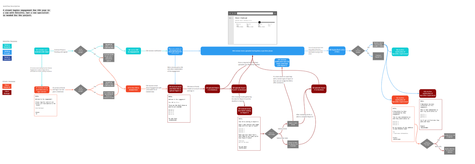
Of the issues we identified in the client’s workflow, only a few marked in red were software-related.
Introducing a new application into this workflow would only have exaggerated the issues our client needs to solve. By conducting a UX audit, we turned our client away from a path that was sure to fail.
That’s the value of an in-depth examination of your UX design: you can uncover the most important problems, the ones you’ll benefit the most from solving before you start to spend resources on solutions.
The rest of this article explains what a UX audit is and the principal benefits you’ll receive when you do one right.
When to conduct a UX audit
You don’t have to have a user experience team to reap the rewards of a UX audit. If you don’t have anyone in-house, you probably have the most to gain, because you haven’t been paying regular attention to your design.
Improving the experience people have with your product is a universal benefit; practically any business will realize a significant ROI from better experience design.
If you’re an entrepreneur with a prototype, a product manager who needs to reduce churn, or an IT leader who needs to make sure employees use this next big app you’re about to release, analyzing your UX will give you a clear understanding of what’s working and what’s not.
Here are some common scenarios for using a UX audit:
When you want to optimize key workflows
You’ve probably heard of the Pareto Principle, where 80% of issues can be addressed by fixing 20% of the problems. The 80/20 rule applies to UX design, too.
Most products have a few workflows that form the foundation of their utility. With Slack, it’s messaging. For Evernote, it’s creating and organizing notes. These products have thrived because they’ve made their primary features dead simple to use.
A UX audit will map the steps people currently take to use the main features of your product, create benchmarks for user engagement, and identify friction points in the user experience.
Here’s an example of a user flow map from one of our recent projects:

If you want to improve the usability of your product, there’s no substitute for watching people use it. It eliminates the guesswork and paints a much clearer picture of what your audience wants.
When you want to boost customer acquisition
Improving key workflows doesn’t just have to apply to current customers; you can also improve how you acquire new customers by auditing your onboarding process.
If you didn’t know, onboarding is the most valuable part of the user journey by some distance. Around 75% of freemium users churn during the first week, so improving your onboarding conversion rate will have a titanic impact on your acquisition numbers.
Auditing your onboarding is similar to examining full-fledged user workflows, with the major difference being onboarding brings marketing into the game. This type of audit will surface valuable voice of customer data that you can use to write more effective calls to action and microcopy throughout the user experience.
You’ll also get a better understanding of the value potential customers want to experience from your product. With that knowledge in hand, you’ll know how to structure your onboarding flow to provide users with a direct to their “aha!” moment.
When you want to improve customer retention
Here’s a business truism: keeping customers is a better strategy than only chasing new ones.
The Harvard Business Review estimates that a 5% increase in retention could boost profits by 25%. Evernote’s “Smile Graph” is a famous visualization of how retention impacts your overall pool of paying users.

Doing a UX audit puts a spotlight on the critical aspects of your user experience and illuminates what people like about your product and what they want you to improve.
Addressing the requests of your audience will make them happier. But even the act itself of building a rapport with users will imbue them with a sense of loyalty to your product.
Increasing retention will also mean reducing support costs. After you find and address the issues that are truly obstructing your users’ work, you’ll find you get fewer support calls, because the product is easier to use.
But what is a UX audit?
We define a UX audit as a process for examining the current state of a product’s digital experience, or a design team’s workflow, and pinpointing major opportunities for improvement.
The techniques involved in that process vary from project to project. There are a couple of considerations to take into account:
-
Are you keeping it light or going deep?
-
Are you analyzing a product or a process?
The lightweight audit
If you’re looking for a highlight real of the most pressing issues in your UX design, a quick audit will surface standout issues. For these audits, we always start with a strategy establish an understanding of the client’s business objectives, and then do a heuristic analysis and competitive research.
The heuristic analysis is an expert review that compares the product’s current design against time-tested UX principles. It’s not the most meticulous approach, but this technique still identifies opportunities that make a significant difference in usability.
Competitive research is just what it sounds like. We compare your product’s design to your competitors. This builds a better picture of what your audience may expect when they use a product like yours, and spies opportunities for you to design a superior experience to your competition.
This type of audit can answer questions like:
-
What are the most immediate ways I can improve my experience design?
-
What is my competition doing that I’m not?
-
What can I do that my competition isn’t?
(By the way, we do this kind of UX audit at no charge for qualifying companies.)

The in-depth audit
When you want to do a comprehensive investigation of your experience design, we employ a greater range of techniques. It’s important to note that the distinction between a UX audit and full-on user research is pretty non-existent at this point.
For this type of audit, we’ll use a collection of techniques to identify your users’ pain points and goals, map out how they currently perform their tasks and uncover ideas for designing an optimal solution based on how your audience works.
The methods vary based on your business objectives, but here are some of our favorites:
User Interviews: Talking to people who use your product is one of the best ways to do generative research, which “generates” ideas on your audience’s current UX trials and tribulations
Surveys & Focus Groups: Both techniques are effective ways to identify patterns in the problems users are having with your product or the tasks your product is meant to solve.
Observational Research: To truly audit your user experience, you need to watch people interact with your product and map out their workflows. This way you pick up on problems that people forget to articulate. This type of research takes several forms, like field research, contextual inquiry, or unmoderated usability testing.
Benchmarking: Any audit worth doing will create benchmarks for task completion, conversions, abandonment rate, and other important UX metrics. You’ll need to this data to compare against the performance of your redesign.
When you’re optimizing a process
Most people think of UX audits as a method for planning a product redesign. It’s also a viable method for redesigning a workflow.
Our client from the beginning of this post was convinced they needed a new application. Instead, we audited how their team did their work and uncovered numerous inefficiencies in the way they completed their tasks.
It’s also possible to audit the process a design team uses. Sometimes UX teams are composed of perfectly capable designers who simply aren’t as experienced with the human-centered design process.
In this scenario, you play more of a UX consultant role and map out more effective ways to gather research, integrate it into the design process, and collaborate with development based on your audit results.
***
The difference between companies with superlatively designed products and those with mediocre user experiences is that one employs geniuses and the other doesn’t.
It’s that the former takes the time to uncover the problems that matter to their users and address them. The latter just guesses and hopes for the best, the business equivalent of playing darts with a blindfold on.
A UX audit is a scientific approach to validating design, and indeed business, decisions. Who wouldn’t want to make sure their strategy is right before they put it into motion?

UX best-practices consultation!
Review your product with our industry leaders today at no cost.
Table of Contents

UX best-practices consultation!
Review your product with our industry leaders today at no cost.


