Why UX Prototyping Consistently Leads to Better Designs
Perhaps more than any other method, UX prototyping encapsulates the evidence-based approach of human-centered design.
Zach Watson

Perhaps more than any other method, UX prototyping encapsulates the evidence-based approach of human-centered design.
Historically, designers cordoned themselves off while they designed user interfaces and mapped out website architecture. Save for a few choice stakeholders or colleagues, few people were consulted for feedback until a detailed version was released.
In contrast, UX prototyping is an iterative approach to design.
Instead of attempting to create a work of art without any feedback, prototyping introduces rough drafts of the final design to end-users and stakeholders alike, as early as possible. Users give feedback on the prototypes and designers implement changes based on the audience’s input.
 The UX prototyping process is built on user testing and feedback. Photo credit: Adobe
The process repeats until stakeholders and users agree that an optimal version of the user experience has been reached.
This reliance on evidence instead of ingenious is the primary difference between UX design and what people traditionally consider design, i.e., someone with visual design skills creating a graphic. The result is a more practical, cost-effective, and scalable approach to designing a loveable solution.
The rest of this article will explore the benefits of UX prototyping in greater depth. In the following paragraphs, You’ll learn
-
What a prototype actually is
-
The benefits of UX prototyping
-
Types of UX prototypes and when to use them
What is a prototype?
A prototype is best defined as “an early release of a product built to test a concept or process or to act as a thing to be replicated or learned from.” In an appropriate bit of linguistic history, the word prototype descended from the Greek word prototypon, which roughly translates to primitive form.
Prototypes are the first attempts of designers and engineers to solve a problem for their audience.
Prototypes are often associated with consumer products or machines, and there’s some truth to that. It’s common practice to develop test versions of products before mass producing them.
This test version of the original super soaker is a shining example in the long history of prototyping. Despite the genius of its idea, the first iteration of the Super Soaker looks to be constructed primarily of PVC pipe.
 Behold, the genesis of the Super Soaker. Photo Credit: Gizmodo
Of course, that’s the entire point. This version was cheap to develop, but it allowed its creators to test the idea of what it was like to blast other people with a water gun.
If people liked the idea of the Super Soaker — which they definitely did — then a more sophisticated version could be produced with a reasonable degree of confidence that people would be the product.
(If you want more see more prototypes of famous technology, there’s a decent list here.)
Prototyping for user experience design functions more or less the same way. Based on their UX research, a designer creates a primitive version of the user experience and presents it to stakeholders and end-users to test and critique.
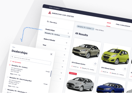
Prototypes can take a few different forms — which we’ll explore soon — but for clarity’s sake, here’s an example of a prototype from one of our recent projects:

In this example, a lot of the design elements are in place, but the colors, fonts, and other highly detailed aspects of the design are not included. This prototype gives users enough to navigate the interface and get an understanding of the user experience.
The benefits of UX prototyping
In the 1980s, software development failed on a semi-regular basis. The development cycle was so long that once the application was finished, the needs of users had moved on.
In business settings, software applications rarely considered the UX, so even when people could use the software to do their jobs, the design was so laborious that users still despised it.
Prototyping, similar to the MVP approach in Agile software development, is an evidence-based practice for validating that the people who will actually use the software help shape how it looks, works, and feels.
In that regard, there are several major benefits to using prototypes in UX design.
Risk-reduction
Every UX design and software development project harbors an existential dread: what if no one uses the product when we launch it?
Prototyping addresses this fear head-on by testing example designs with users early and often in the process. By sourcing feedback from your audience, you’ll be able to identify problems — or opportunities — with nearly every area of a digital product. This insight establishes parameters for your next iteration, which will then be subject to user feedback.
So before a single splash of color has been added, the placement of the design elements in the interface should be justified with user feedback. Likewise, before any line of code is written, the UX design should have reached a consensus with both stakeholders and developers.
From a business perspective, UX prototyping is a kind of safeguard. When done well, it ensures you understand and approve of your product’s design before it ever launches.
Related: Should You Work with a UX Agency or Hire In-House?
Cost-saving
No prototype is perfect, so there will be changes as the design goes through multiple rounds of testing. This is an ideal scenario because it helps you iron out bugs and misplaced designs like a metalworker would eliminate imperfections in a suit of armor.
But if you need to make changes later in the design process, then you have a problem. The further you along in the process you are, the more sophisticated the design becomes. And the more expensive it becomes to fix.
If you have to make wholesale changes in the development phase, then your costs will skyrocket. That’s why you should prototype as early as possible. The sooner you identify important problems, the cheaper they are to fix.
Alignment
The product development process is a complex endeavor. One small miscommunication could result in hours of wasted work. Prototypes are also an excellent method for keeping everyone on the same page.
The process is simple: whenever users review prototypes, so do stakeholders and developers. If the design is veering off course relative to business goals, stakeholders can right the ship. If a particular design element — or indeed an entire feature — isn’t feasible from a code perspective, developers can give their input and head off problems as soon as they emerge.
All the Different Kinds of UX Prototypes
The prototyping process is sequential by design. In the beginning, simple UX prototypes confirm the design is moving in the direction in a broad sense. Subsequent prototypes build on earlier insight and become increasingly more detailed.
Throughout this process, different types of prototypes serve different purposes. Here’s an overview of the three main species of UX prototypes and when it’s best to use them in the design process.
Paper Prototypes

Throughout history, inventors of all types have scribbled their ideas down on pieces of paper. Most likely it was so they wouldn’t forget them, but assuredly there’s been many times when they were used to get feedback on an idea.
The same is true today. The earliest kind of UX prototype is usually a paper version. A recent study found that 64% of designers favored a pencil and paper over any other design tool.
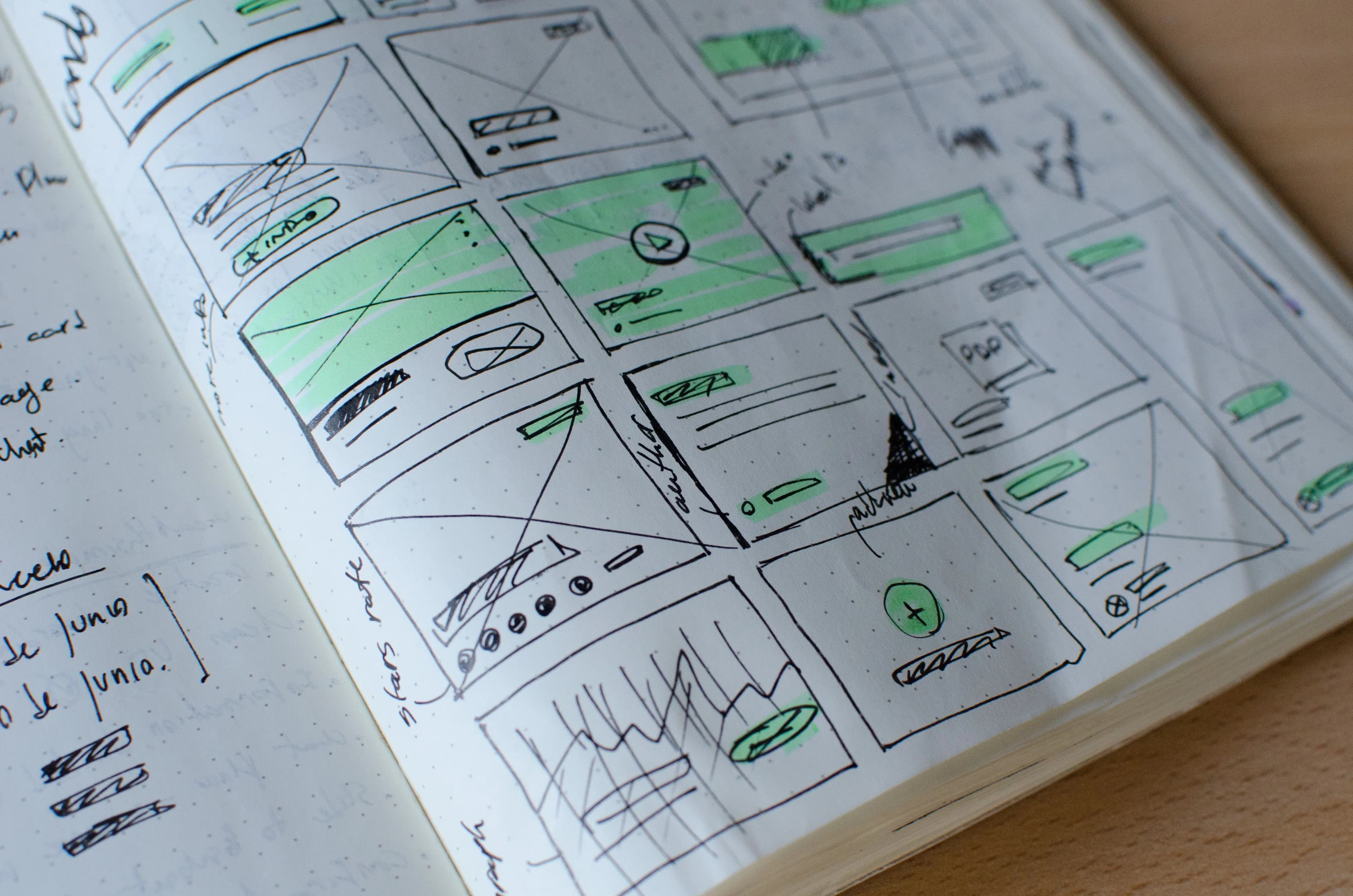
Paper prototypes can be used to augment a discussion about an idea or as an actual means of testing a design. In the latter scenario, designers may sketch out a series of tasks they’re envisioning for the product design or even the entire user experience.
They’ll test this prototype with users by having the users touch the paper prototype like they would a smartphone to mimic how they would navigate the interface.
Naturally, these prototypes are incredibly primitive, but they can be critical for discovering if an idea is worth pursuing.
Low-Fidelity Prototypes
Low-fidelity prototypes are your design’s first foray into the digital world. These prototypes are typically black and white with the general makeup of the user experience composed of simple design elements.
Here’s an example from a recent project of ours:

By excluding typical design details like color and typographic styling, low-fidelity prototypes (synonymous with UX wireframes) are excellent mediums for gathering feedback from users and stakeholders on how to experience design, i.e., how it feels to use the design.
It’s also substantially easier to make changes to low-fidelity designs than it is later in the process. These are the prototypes that designers will use to rapidly iterate the design and optimize the experience to fit the behavior and expectations of the end-users.
High Fidelity, Clickable Prototypes
At last, we arrive at the fully interactive UX prototypes. Based on the multiple rounds of feedback gathered using low-fidelity versions, designers will create UX prototypes that you can click and navigate just like a real website or application.

If the UX firm has done its job correctly with the previous prototypes, the changes are this point in the process should be narrow in nature. Designers are trying to optimize specific parts of the interactive design rather than create entirely new screens.
These prototypes are utilized to conduct most usability testing, where quantitative metrics like conversions, task completion rate, and drop-off percentage are used to measure the effectiveness of the UX design.
***
UX prototyping is an integral part of human-centered design. Prototypes give designers a shared reference point with the people they’re designing for, so the experience design can evolve based on actual feedback, rather than someone’s assumptions.
If the UX prototyping process goes well, you can feel reasonably confident that your audience will like your product design.

UX best-practices consultation!
Review your product with our industry leaders today at no cost.
Table of Contents

UX best-practices consultation!
Review your product with our industry leaders today at no cost.


